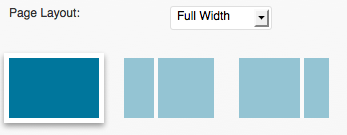
Coffee & Cream includes a page layout builder on every single content like pages, posts & portfolios but this can be configured for index pages too, like blog, portfolio home, tag & category pages.
Global Layout
Choose if you want a fullwith layout or Sidebar Layout (left & right options). The sidebar layout will enable the custom sidebar selection.

Display Type
You can then select the display type from 7 possible.
- wide
- wide 2
- list
- list 2
- grid (only available for indexes)
- masonry (only available for indexes)
- mosaic (only available for indexes)

Thumbnail ratio
For list 1 & list 2 display types, you can choose the post thumbnail ratio.
it means the size of the picture regarding the room it has. ie: 50% means that the picture will take half of the available space.

Thumbnail Format
For list 1,list 2& grid display types, you can choose the thumbnail format from 4 available formats:
- square
- rectangle
- rectangle 2 : more wide, panormaic
- rectangle 3: a vertical format

Number of columns
For grid, masonry & mosaic layouts, you can select the number of columns.

Thumbnail style
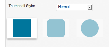
Finaly, you can although select the thumbnail style: normal, rounded corners or circle (works better with the square images).

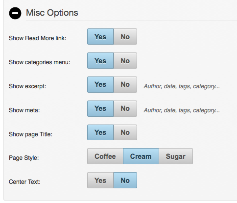
You can do more customization in the misc options…
- Show/Hide the read more link (index pages only)
- Show/Hide the category menu (index pages only) & select if the menu is sortable (grid, masonry & mosaic layouts only)
- Show/Hide the excerpt (index pages only)
- Show/Hide the meta . You can although set which meta to display in the theme options
- Show/Hide the page title
- Change the page color scheme : coffee, cream or sugar
- Change the page text centering

“Ok, you are right, I admit: it’s not infinite but can any of you guys tell me the number of possibilities it offers? 😉 Thanks!
Coffee & Cream has another killer feature: you can have a different layout for every category, every tage, every portfolio category.
It means that a portrait category could display a perfect layout with vertical pictres when a panoramic landscape pictures category could use the wide display with panoramic pictures. Nice, isn’t it?